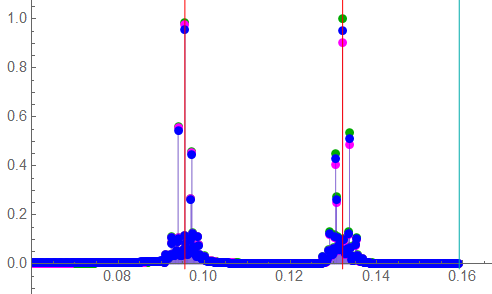
Consider a situation in which an airborne measurement platform travels in the x-direction while the measurement instrument scans between ±y centered about x. The instrument transmits several known frequencies and detects a return signal. The signal frequencies are such that the free-space wavelengths are a significant portion of the aircraft altitude. As the instrument sweeps ±y, the transmit length changes such that the phase angle is significant to the measurement. If the reflecting surface is assumed uniform, the change in phase angle may be estimated with a sinusoidal function such that the function ![]() becomes:
becomes:
![Rendered by QuickLaTeX.com \begin{displaymath} \begin{align} sin(\, 2 \, \pi \, f \, t \, + \, \phi \, ) \; &\Rightarrow \; sin[\, 2 \, \pi \, f \, t \, + \, sin(\, 2 \, \pi \, f_{\phi} \, t \,) \, ] \\ \\ &\Rightarrow \; 2 \: cos(\, \pi \, f \, t \, ) \: sin( \, \pi \, f \, t \, ) \: cos \left[\, sin ( \,2 \, \pi \, f_{\phi} \, t \, ) \, \right] \; + \; sin \left[ \, sin ( \,2 \, \pi \, f_{\phi} \, t \, ) \, \right] \, \left[ \, cos^2 ( \, \pi \, f_{\phi} \, t \, ) \, - \, sin^2 ( \, \pi \, f_{\phi} \, t \, ) \, \right] \end{align} \end{displaymath}](https://davemcglone.com/wp-content/ql-cache/quicklatex.com-2bba3ea9a9edafeca194885aa1a9bec1_l3.png)
The expansion isn’t particularly enlightening other than to indicate the signal is modulated by the phase. This suggests the possibility of amplitude demodulation techniques for signal analysis – a topic beyond the scope of this discussion. In practice, the reflecting surface is not uniform and will have spatially-varying characteristics.
I want to look at the effects of an ideal sine variation of phases on the primary signals after filtering. There are a lot of plots as a result …
In the previous section, it was shown that a sample rate of 5000x the highest signal frequency was able to adequately detect frequency components of the filtered signal. The following illustrations use a sample length of 5003 – the first prime number above 5000. All amplitudes are 1; the sum-of-sines is scaled to ½ so that the peak amplitude of the summed signal is 1. The phase varies sinusoidally between ± π. The filters remain normalized to 1 rad/s (0.159 Hz); the signals are scaled appropriately. The sample frequency is 2 rad/s (0.318 Hz).
The source signal function is:
½ [ sin ( ω1 t + φ ) + sin ( ω2 t + φ ) ] ⇒ ½ { sin [ ω1 t + sin ( ωφ t) ] + sin [ ω2 t + sin ( ωφ t) ] }
⇒ ½ { sin [ 2π f1 t + sin ( 2π fφ t) ] + sin [ 2π f2 t + sin ( 2π fφ t) ] }
Set 1: Bandwidth Extremes: ω1 = 0.1 , ω2 = 0.9
I’m going to use approximate values of an actual project. I’ve kept the relationship between filter corner frequency and sample frequency. The normalized and ideal signal bandwidth will be defined as 0.1 → 0.9. The phase shift is a geometrical effect due to sweep rate and is identical for all signal frequencies. The signal bandwidth being essentially a full decade, the phase effect will be frequency dependent. The group delay of the Butterworth filter is also frequency dependent; that of the Bessel filter is constant over this bandwidth. The actual system processed many frequencies within this bandwidth; I’ll stick with comparing only two simultaneous frequencies as described by the above expressions.
I’ll start by looking at a combination of the signal extremes.

This filter magnitude response plot is truncated to show the passband to the Butterworth corner frequency at -3dB. An amplitude of -3 dB corresponds to an absolute magnitude of 71% of the “ideal” magnitude of 1.0
The locations of the signal frequencies are shown in RED.
At the low frequency, the differences in absolute amplitude are basically insignificant … although the difference between 1.0000 and 0.9993 may be in critical applications. The difference at the high frequency attenuation is significant in both however (0.8361 and 0.9431).

The changes in group delay may be an issue over wide signal bandwidths.
The Bessel delay is uniform across the signal bandwidth; the Butterworth delay varies non-linearly with frequency – between 2.6 and 3.9 for these frequencies.
The ORG trace shows the effect of normalizing the Bessel corner frequency to 1: the group delay increases but remains constant albeit only to a lower frequency.
The frequency-normalized Bessel is barely adequate in terms of constant group delay in this application. “Adequate” of course depends on project goals.
Again, the locations of the signal frequencies are indicated by the RED lines.

A time plot of 5003 samples of the input and the two filtered signals with the phase variation superimposed in ORG.
Since the sample frequency is defined and fixed, the number of samples is defined by the time length of the data segment. A sample rate of 2 rad/s is equivalent to 0.32 Hz or Δt = 3.142 s. A data length of 5003 samples is equivalent to a time length of 15,717 s … but this is a normalized value. The low frequency is ω = 0.1 or f = 0.016 Hz. The period is 62.8 s so that a data length of 5003 samples represents 250 cycles of the lowest signal frequency. Consider a de-normalized frequency of ω = 100e3 rad/s. The frequency would be 15.9 kHz, the period 63 μs, and the data length would be 16 ms.

A short segment of the above sample set without the phase variation. GRN is the source signal; BLU and MAG represent the filter outputs.
The effect of the group delay is apparent although at this scale, the effect on the higher frequency is more apparent. The Bessel (BLU) follows the input more closely than the Butterworth (MAG) though over a long enough period of time, the difference is less significant.
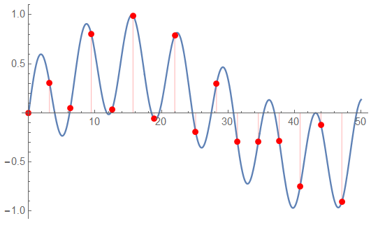
A wider segment of the data to be processed showing the sample points. This plot only shows the unfiltered signal. The high frequency is 0.9 rad/s; the low is 0.1 rad/s.
 The full spectrum of this data segment. Frequency units are Hz.
The input (GRN) should be 1.0 for each component but it appears signal energy is dispersed due to phase modulation – and perhaps there was insufficient information at the low frequency to adequately determine the amplitude. Notice the decrease in amplitudes at the higher frequency. The energy is still dispersed but to a lessor degree – more high frequency cycles to analyze.
While the phase modulation is very evident there doesn’t appear to be any significant inter-modulation at these frequency extremes.
 The positive spectrum. This is the information of primary interest in this discussion.
The normalized Signal amplitudes at both f1 and f2 are expected to be 1 (0.5 if not normalized).
The modulation effect of phase is evident.

The Fourier data is complex; the phase component is an important part of the analysis. This plot shows the full spectrum. The RED lines (barely visible) indicate the ideal frequencies; the CYN line (not readily apparent but at the right) indicates the Nyquist limit.

The positive frequencies. The phase shift effects are prominent.
The other sets have similar plots; I’ll trim the number shown … the sample parameters remain the same – the only differences are the signal frequencies.
Low-End Adjacent Frequencies: ω1 = 0.10 , ω2 = 0.17
The actual project contains many frequency components. At the low end, the adjacent frequencies are 0.1 and 0.17 rad/s.
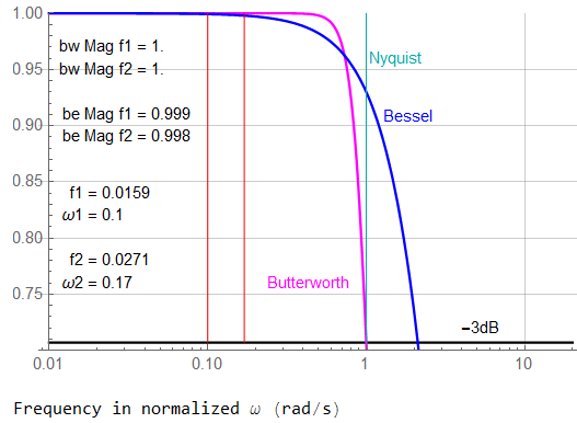
These frequencies appear at first glance to be in the unity-gain section of the filters – very much lower than the filter corner frequencies. This is true for the Butterworth; a bit not-so for the Bessel.

The group delays also appear to be within the constant region at first glance. This time, the estimation is true for the Bessel, a bit not-so for the Butterworth.
Is the difference important? Probably not … and even less so if this was the high range of signal bandwidth.

The data time length is the same as the first example; this is a short segment of the signals. The frequencies are low enough that the differences between the original and filtered signals is minimal.

The spectrum indicates a bit of inter-modulation. The Nyquist limit is indicated by the CYN line, the ideal frequencies by the RED lines.

The positive spectrum seems to indicate less of an effect of inter-modulation distortion …
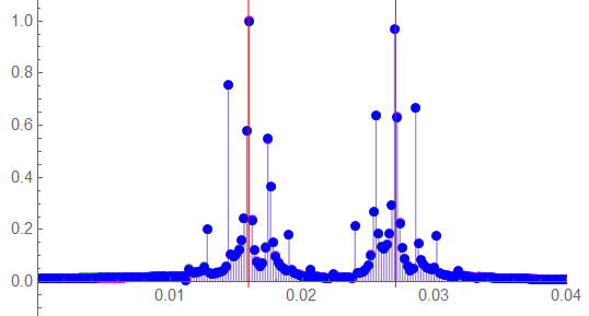
… and a detailed view shows the effect seems minimal.
The energy is spread making amplitude measurement difficult.

A detailed view of the positive frequency phase can indicate the sweep frequency with proper analysis (which was not performed for this discussion).
High-Mid Range Frequencies: ω1 = 0.60 , ω2 = 0.83
Two non-adjacent frequencies in the high end of the middle bandwidth range.
Although still in the passband, the filtered amplitudes are quite different. This can be significant when trying to measure an expected amplitude of “1”. This is very noticeable in the Butterworth response where the ideal amplitude at ω1 is 0.992 and 0.903 at ω2.
These frequencies are also within a region of maximum group delay change (group delay is the derivative of phase; this change would be the 2nd derivative of phase).
Again, does it matter?
The initial response due to a step change (such as switching of a sample/hold). The Butterworth response (MAG) shows considerable lag.
A bit longer segment (50/5003) of the input signal with sample points indicated.
The positive spectrum ….
The detailed view of the positive spectrum shows the effects of filter attenuation, particularly at the higher frequency (ω2 = 0.9)
A detailed view of the positive frequency phase spectrum.
High-End Adjacent Frequencies: ω1 = 0.83 , ω2 = 0.90
The other end of the bandwidth: two adjacent frequencies well within the attenuation range of the filters, The Nyquist limit (ω = 1) is defined by the sample rate of ωs = 2 and the filter corner frequency was defined by project criteria to be set to the Nyquist limit.
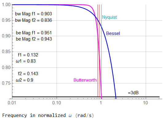 The Bessel filter rolls off slower than the Butterworth. In this situation, that appears to be a good thing but in reality, the Bessel provides less attenuation – and therefore less anti-aliasing – at frequencies above Nyquist. There aren’t any such components in this idealized analysis … but the “real world” isn’t idealized.
Even with close frequencies, the attenuation difference in the Butterworth is significant: 0.903 at ω1, 0.836 at ω2.

However, the frequencies are close enough together that although they occur at the peak delay of the Butterworth, they are essentially identical which is the more critical factor.
But the Butterworth delays are 4x those of the Bessel which remains at unity.

The delays between the responses remain; this plot of the sample points of the input are more meaningful. These two frequencies will have a prominent beat-frequency.

In this detailed view of the positive spectrum, it appears inter-modulation is minimal – whatever “minimal” is in terms of specific requirements. The frequencies themselves are well defined but the energy spreading is prominent and disrupts amplitude estimations.

The phase spectrum sure appears to be a mish-mash, eh?
High-End Adjacent Frequencies: ω1 = 0.83 , ω2 = 0.90 211 samples
This is a lot of plots to absorb but I want to show one more … the same plot as above with a lower sample count. In the above representation, the sample rate was 5003x the filter corner frequency (5 GHz for a 1MHz filter). While not undoable, it generates one heavy truck load of data: 5e9 samples per second. If using 16-bit digital words to represent the data, this is 9.32 Gbyte/sec of data to store and analyze.

Hard to see any detail at this scale. The phase variation is much lower than the signal as expected.
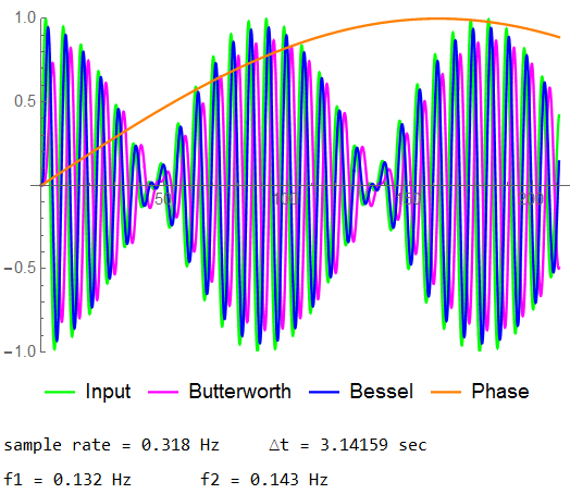
In this detail view, the beat frequency mentioned earlier is quite noticeable. Both phase delay and attenuation are visible.

It was the length of the data sample that was shortened. The sample period remains as it has been.

If the sample rate was changed – to ωs = 4 in this plot – the sampled signal would appear as shown here.

The Signal amplitudes at both f1 and f2 are expected to be 1 (0.5 if not normalized). After all, the defined amplitude was ½ the sum of 1+1
sig[t] = ½ [sin(2π f1 t) + sin(2π f2 t + φ) ]
The Butterworth amplitude should be 0.9254 at f1 ; 0.8361 at f2.
The Bessel amplitude should be 0.9549 at f1 ; 0.9431 at f2.
The interference due to the modulation effect of phase is evident.

The phase modulation in f2 begins to interfere with the response of f1. The attenuation has also decreased by a significant amount from the response shown in the previous plot.
The frequencies may be differentiated; obtaining “accurate” amplitude information would be more complex …

Significant data “smearing” is occurring here. “More data, better accuracy” is part of the lesson.

“Something” is obviously happening at the high end of the signal band according to this phase spectrum.

There is a significant difference in the filtered responses.
Let’s compare some responses with no phase modulation:
“with” phase modulation on the left ; “without” on the right.

Look in particular at the magnitude of the unfiltered signal (GRN) and the Butterworth response (MAG)

As usual, the RED lines are the ideal frequencies; the CYN line is the Nyquist limit.
Differences are also noted in the phase spectra.

The plot without phase modulation is on the right. GRN is the unfiltered signal, MAG is filtered by a 4th-order Butterworth function normalized to a corner frequency of 1, BLU is a 4t-order Bessel filter normalized to a group delay of 1.

The advantage in these analyses is a priori knowledge of the signal under ideal conditions. Consider an analysis of these plots with 6 to 8 frequencies being simultaneously measured in a non-uniform environment with the goal of comparing amplitudes to less than 0.1%.
These last plots were analyzed with 87 cycles of the low frequency of 0.83 rad/s. Different configurations will be examined in later sections.
A full load here … but
That’s good for now …
![]()


